
Rockhurst University had a few problems: their athletics brand lacked consistency, impact, and a cohesive visual presence. The existing hawk logo—intended to be the centerpiece of their identity—was poorly executed and failed to capture the spirit, history, and competitiveness of Rockhurst Athletics.
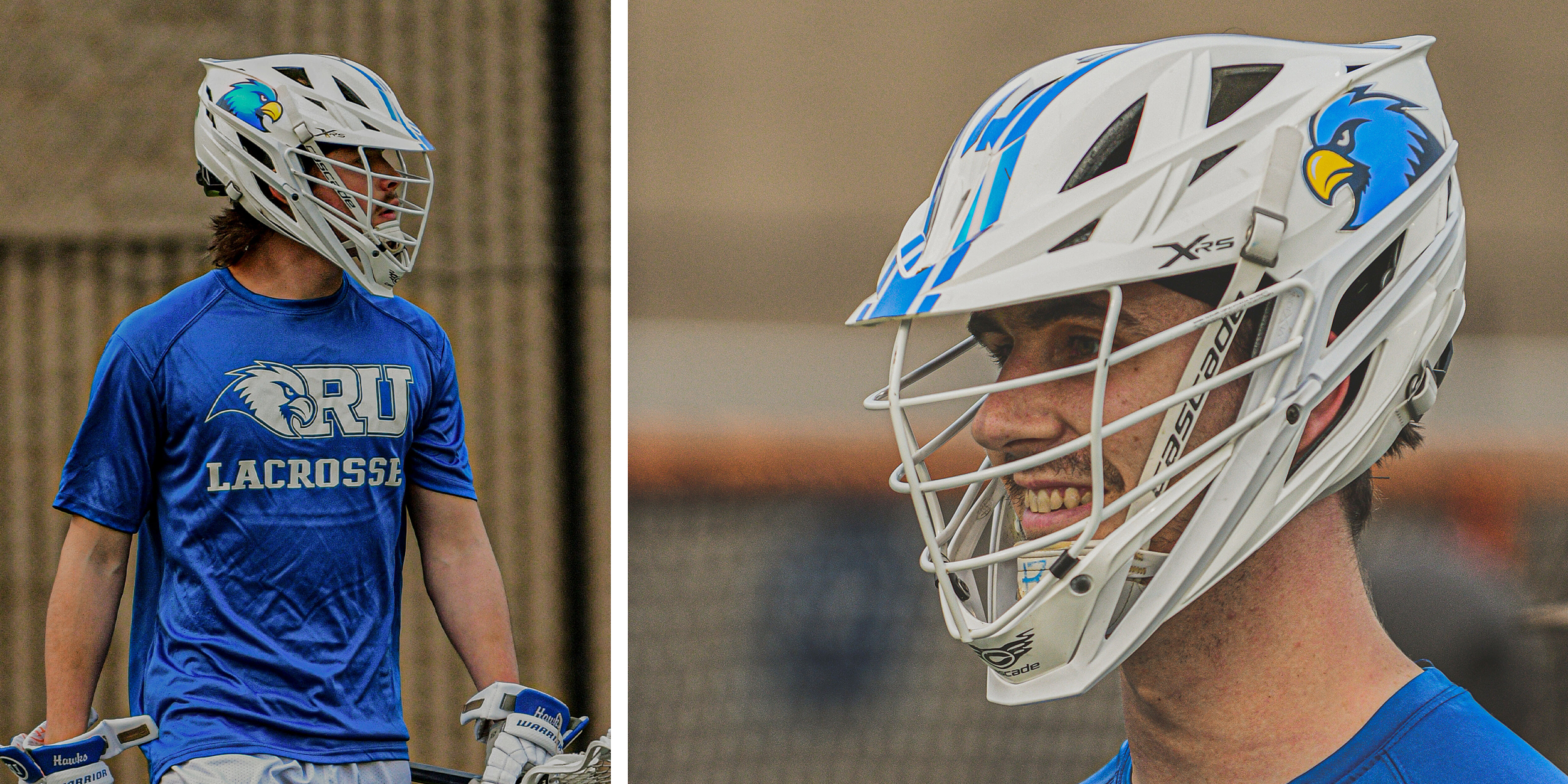
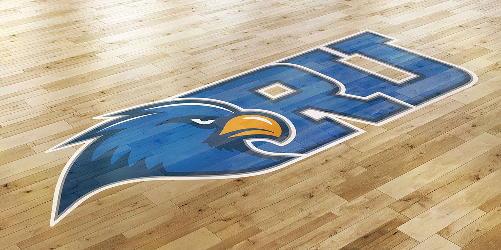
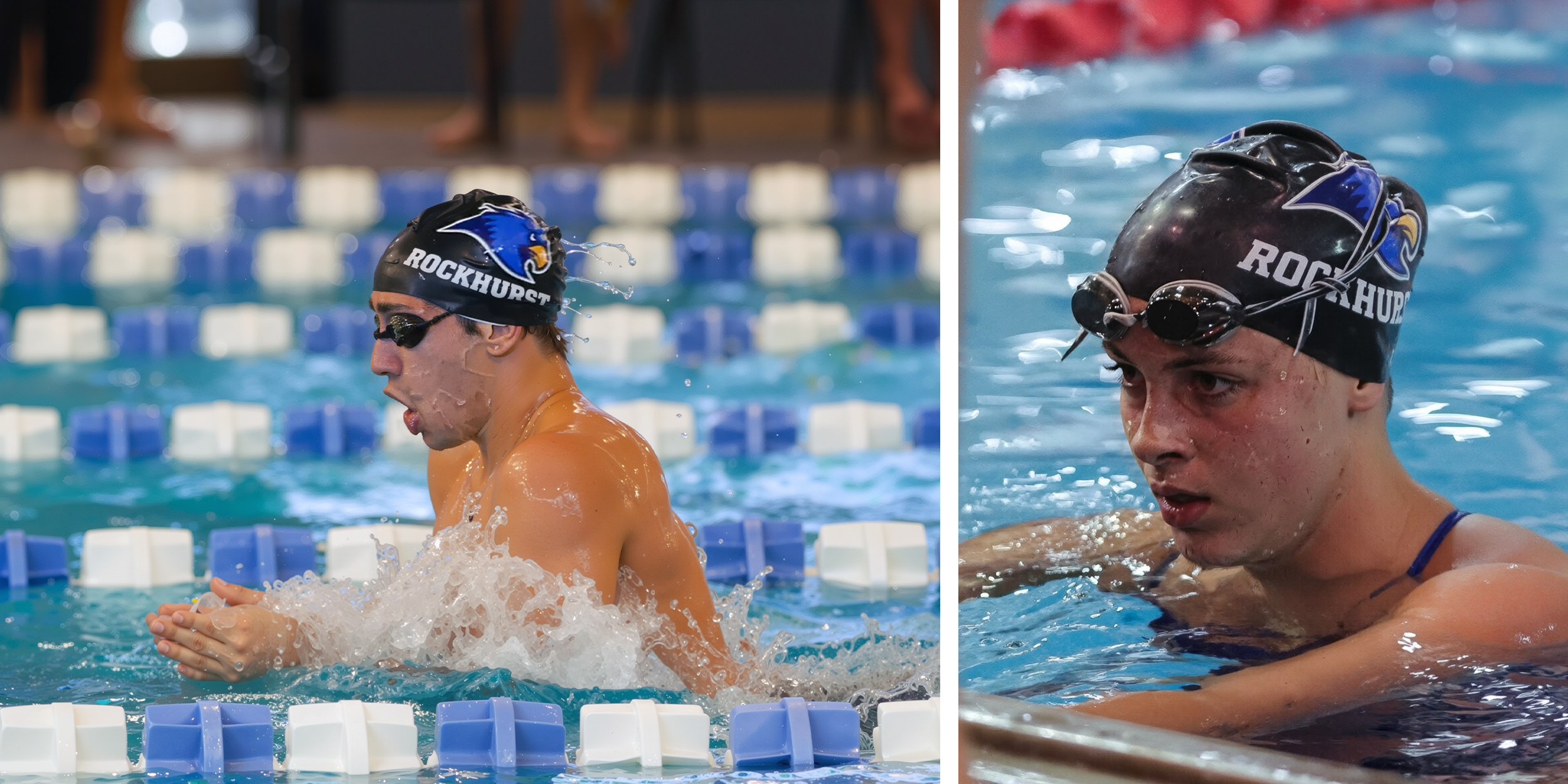
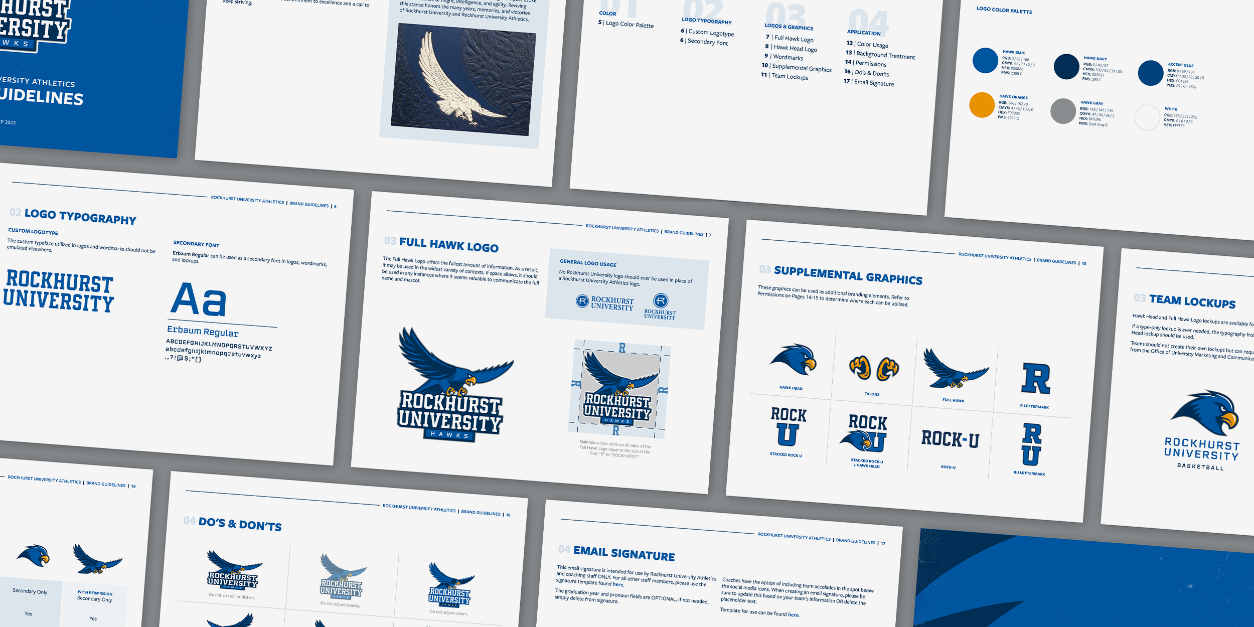
Rockhurst University Athletic Department's identity suffered from an outdated, poorly executed hawk logo and a lack of visual consistency across print materials, apparel, and social media. Without formal brand standards in place, the department relied on improvised graphics that varied widely in style. The goal was to create a cohesive, modern identity that still respected the school’s past iterations of the hawk and the University as a whole.
My team and I researched historic Rockhurst marks and identified a legacy hawk illustration that inspired the new direction. From there, I was lucky enough to have the freedom to lead the redesign and create the bulk of the visual assets for the new brand.


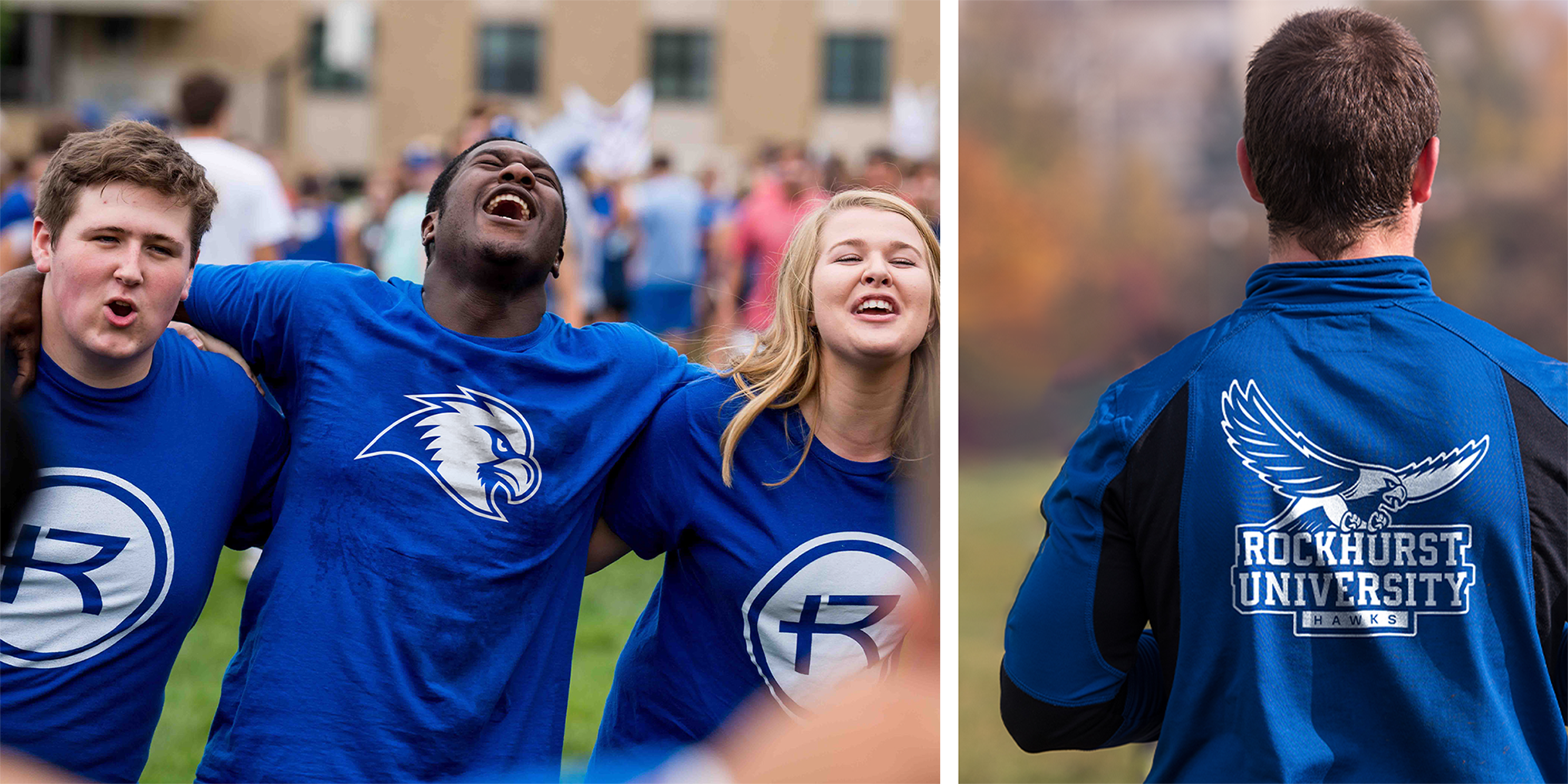
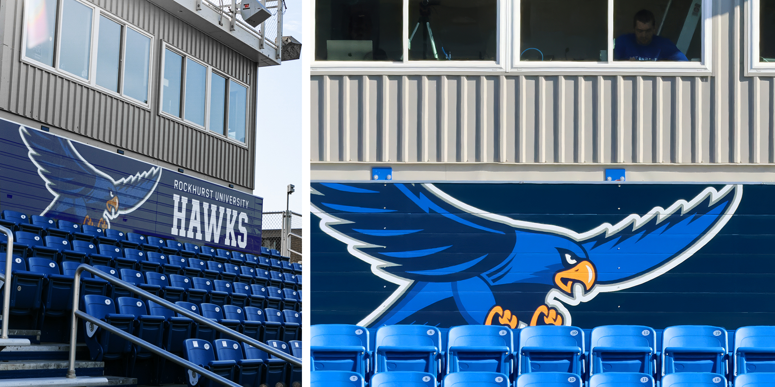
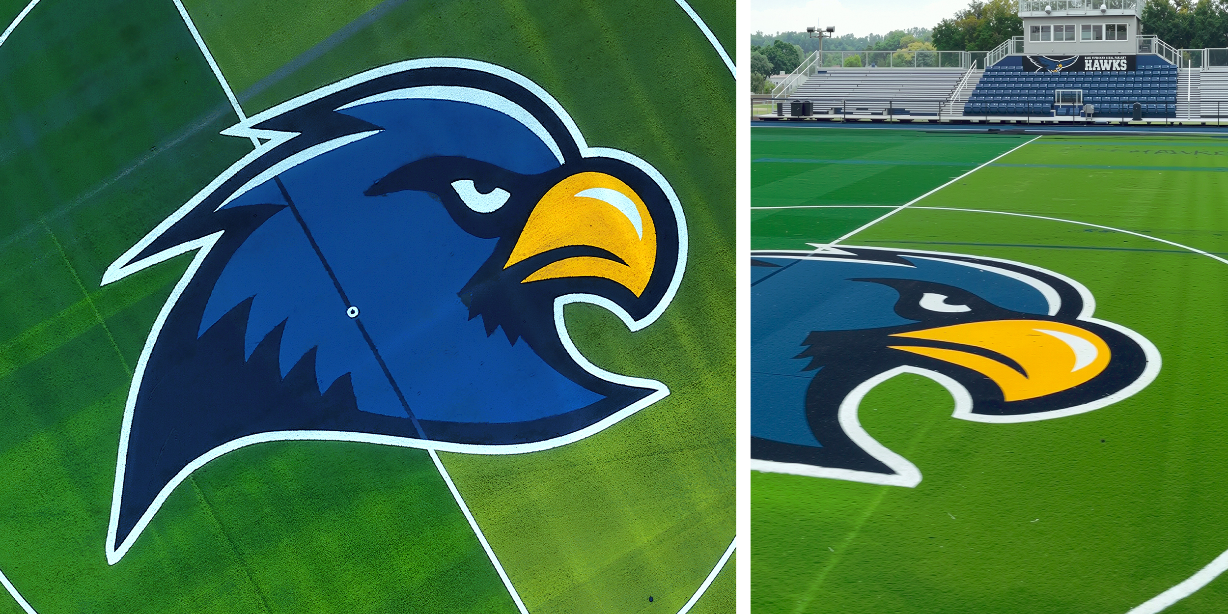
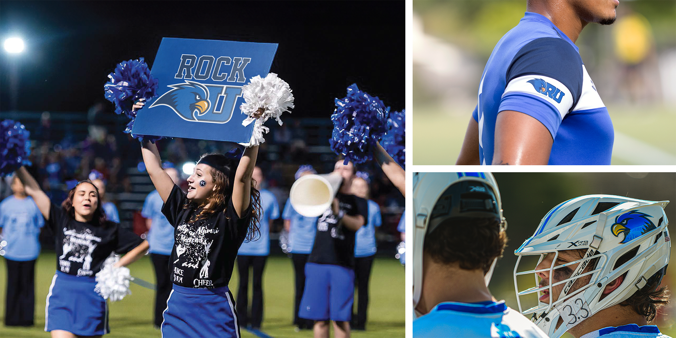
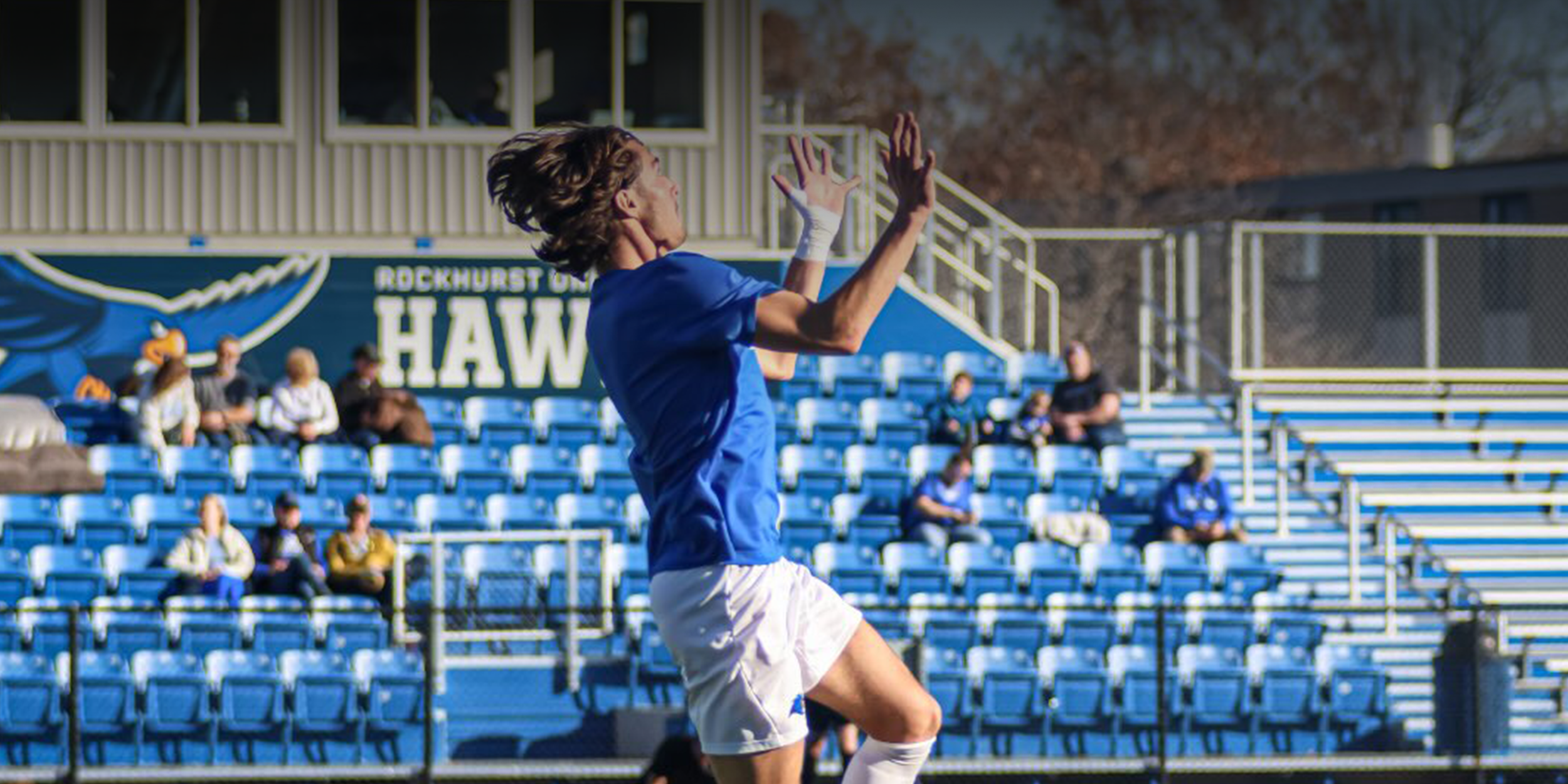
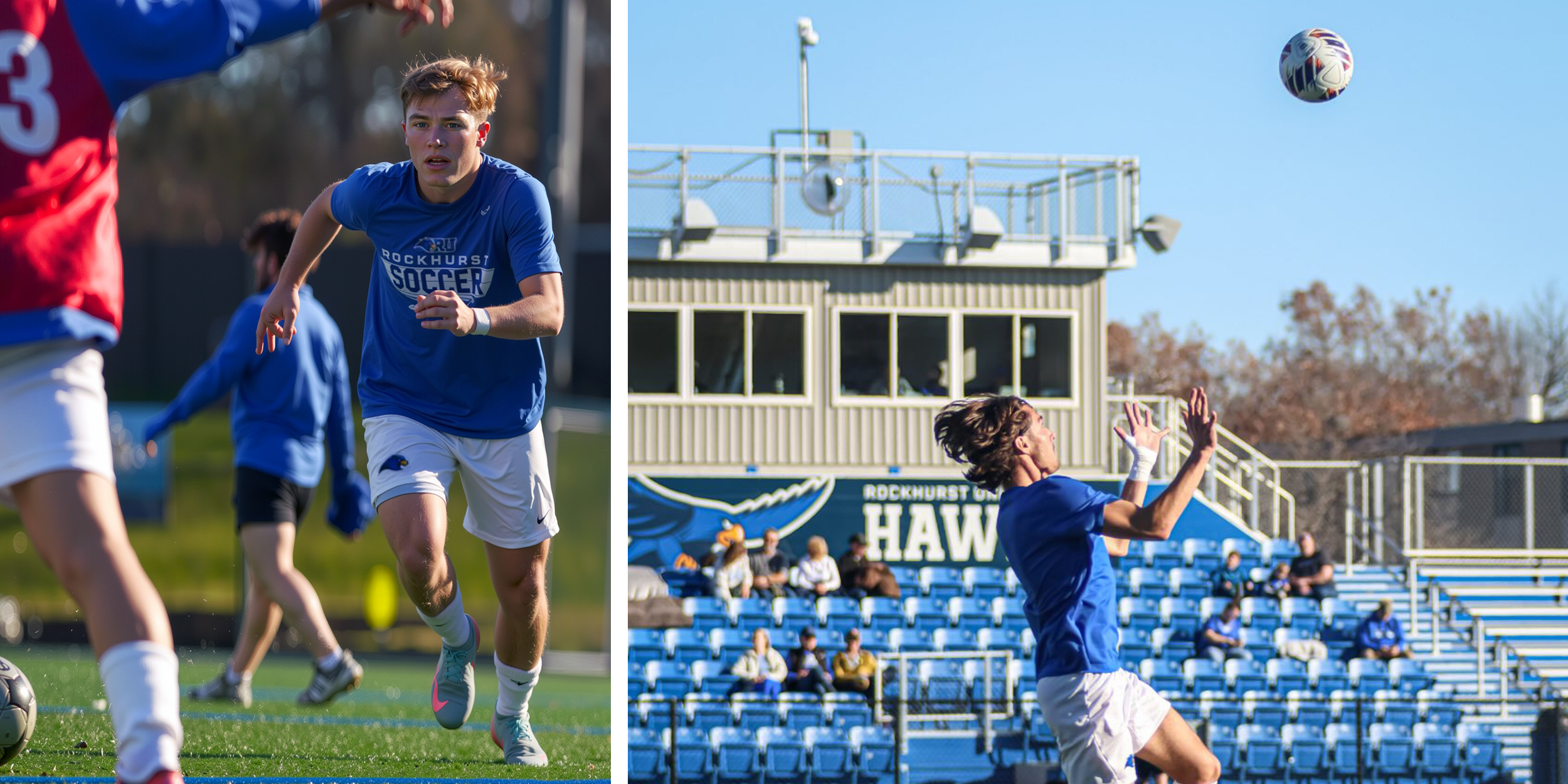
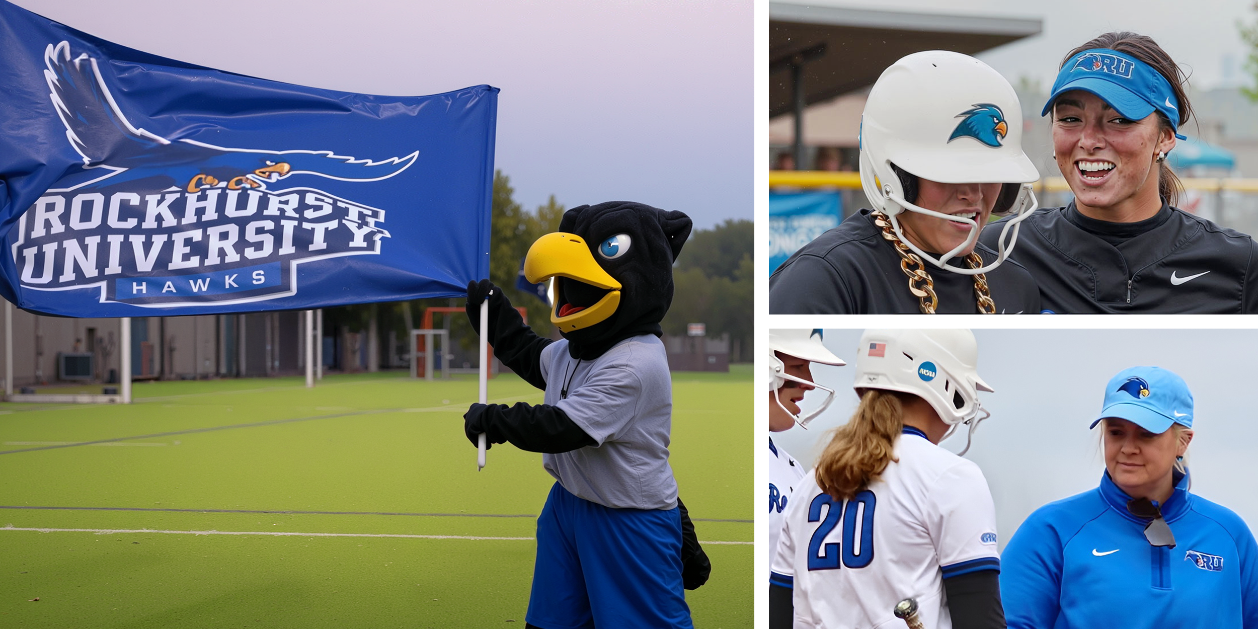
The refreshed brand has significantly strengthened Rockhurst University Athletic Department's presence both on campus and online. Students, staff, alumni, and athletes expressed a renewed sense of pride in the updated hawk identity. The new system also improved consistency across all athletics communication channels, which contributed to increased engagement on social media as well.
Josh Davis, Sara Duncan
Cody Tviet, Bobby Houlette
Abbey Hugo
Oops! Something went wrong while submitting the form

