
Revitalizing a Kansas City Staple through Cohesive Brand Storytelling
P Moore & Moore, a Kansas City barbecue staple, lacked a cohesive visual identity to match its high-quality flavors. The brand was fragmented across mismatched logos and inconsistent assets, making it difficult to stand out in a competitive market. This project required a complete brand overhaul to transform a disjointed local eatery into a professional, recognizable destination.
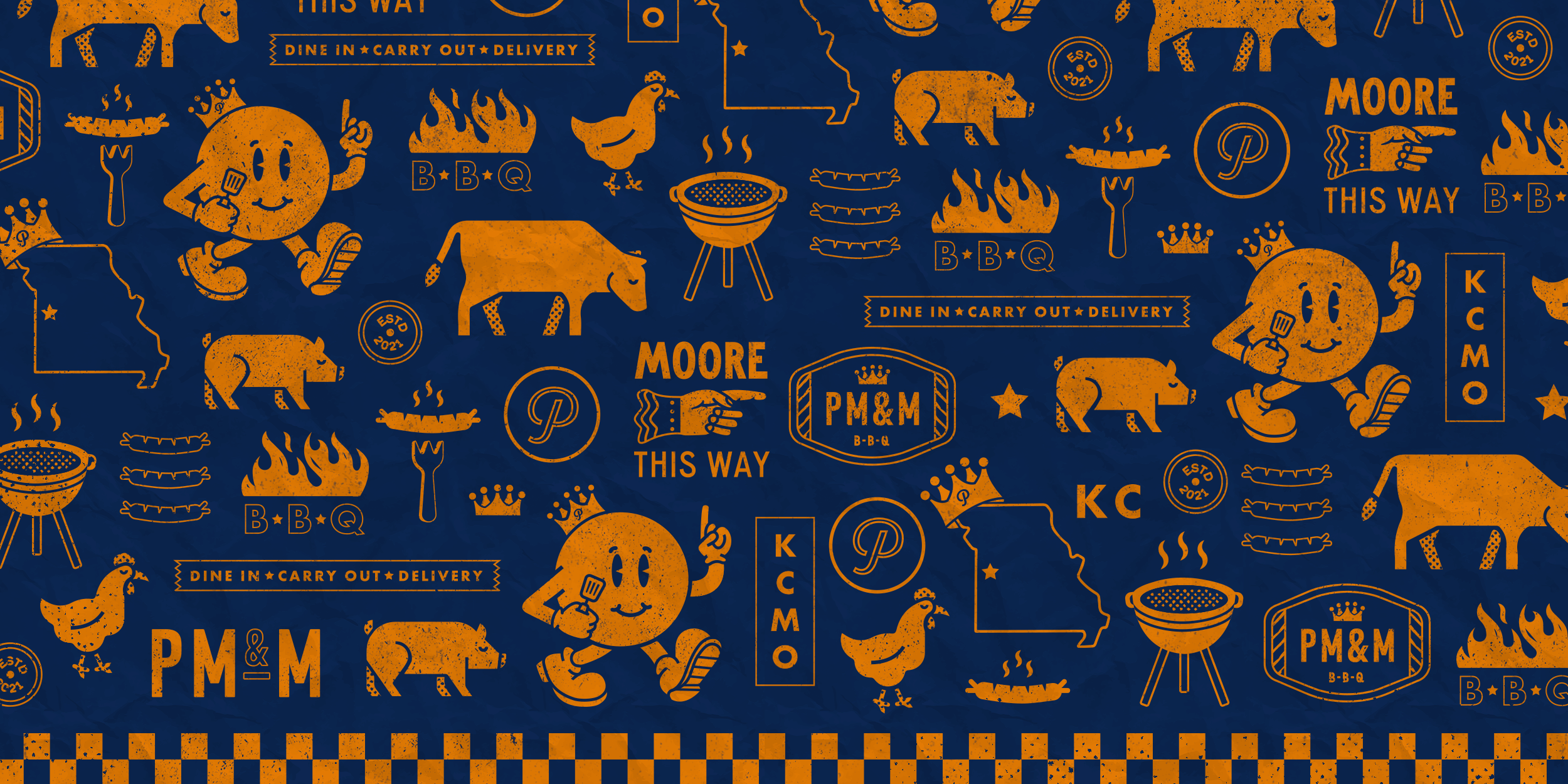
I developed a comprehensive brand ecosystem rooted in classic KC BBQ heritage, utilizing bold typography and a smoky, hand-drawn aesthetic. By blending my branding and illustration skills, I created a primary logo supported by custom patterns and secondary marks. This unified look was applied across every touchpoint, including redesigned menus, digital assets, and high-energy merchandise that modernized the restaurant's traditional roots.
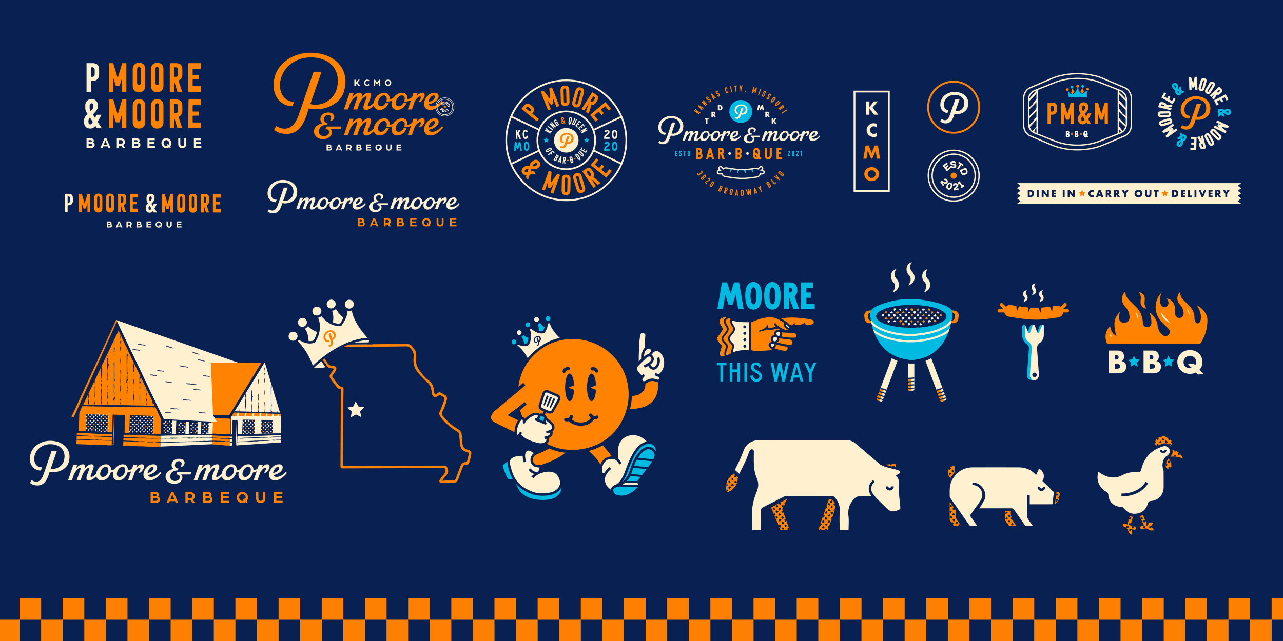
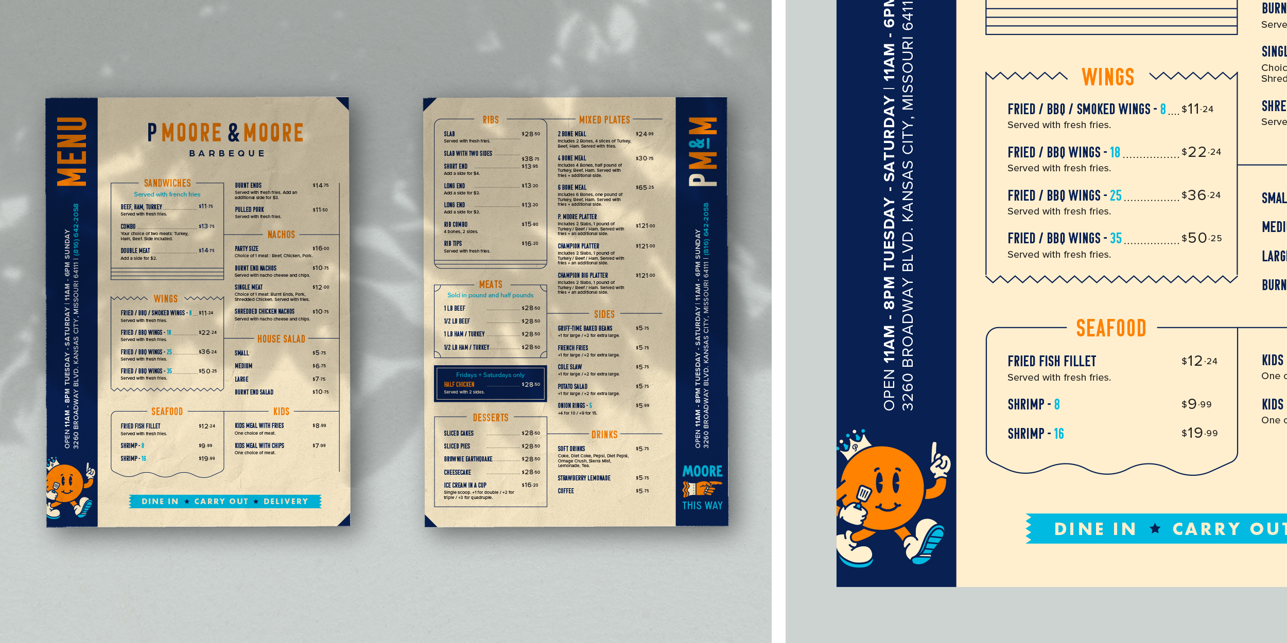
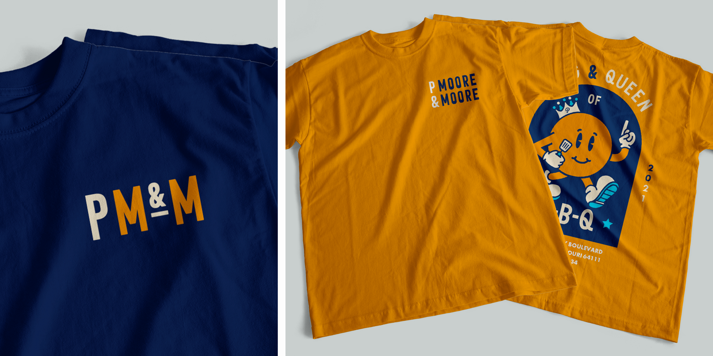
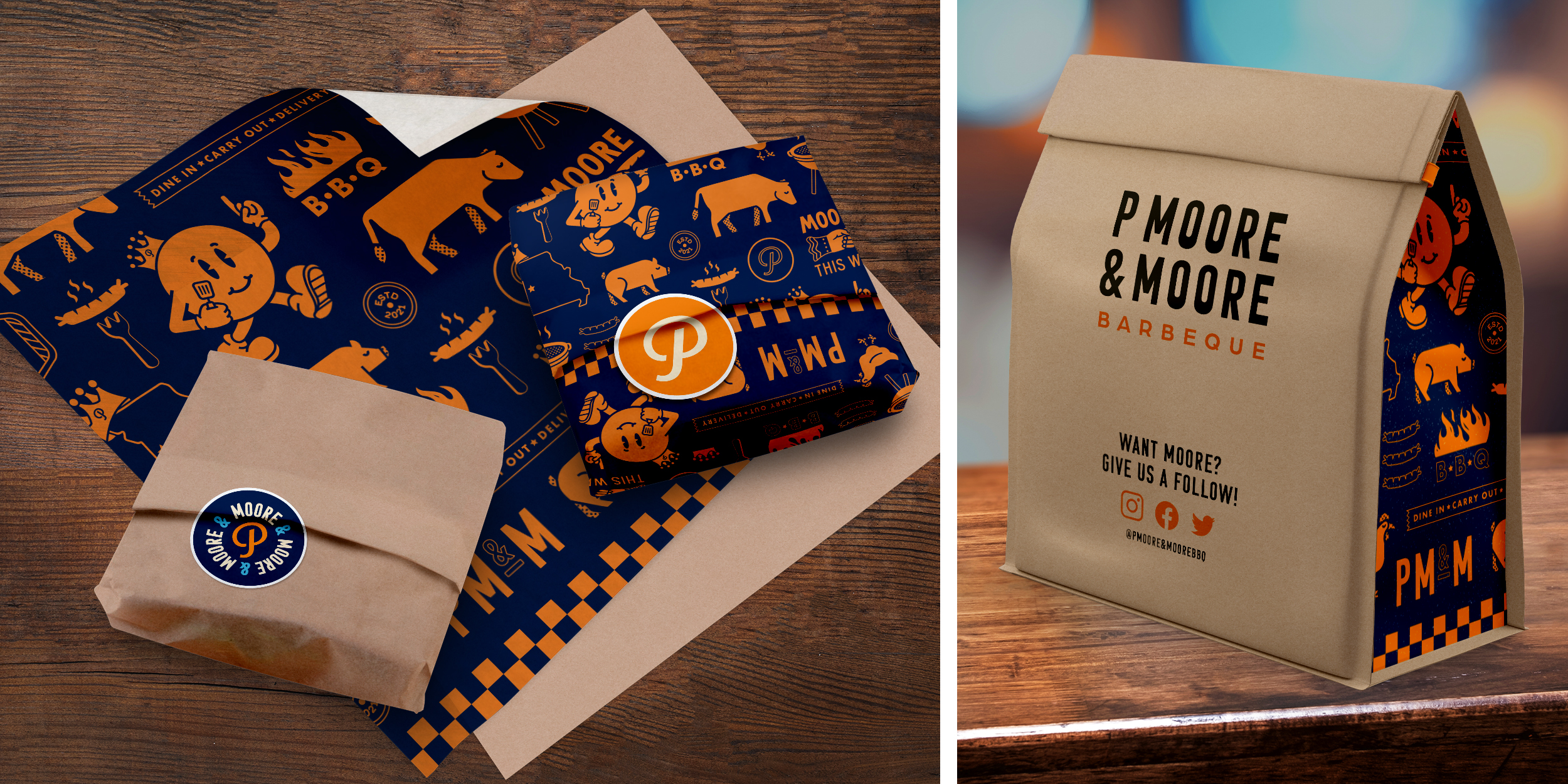
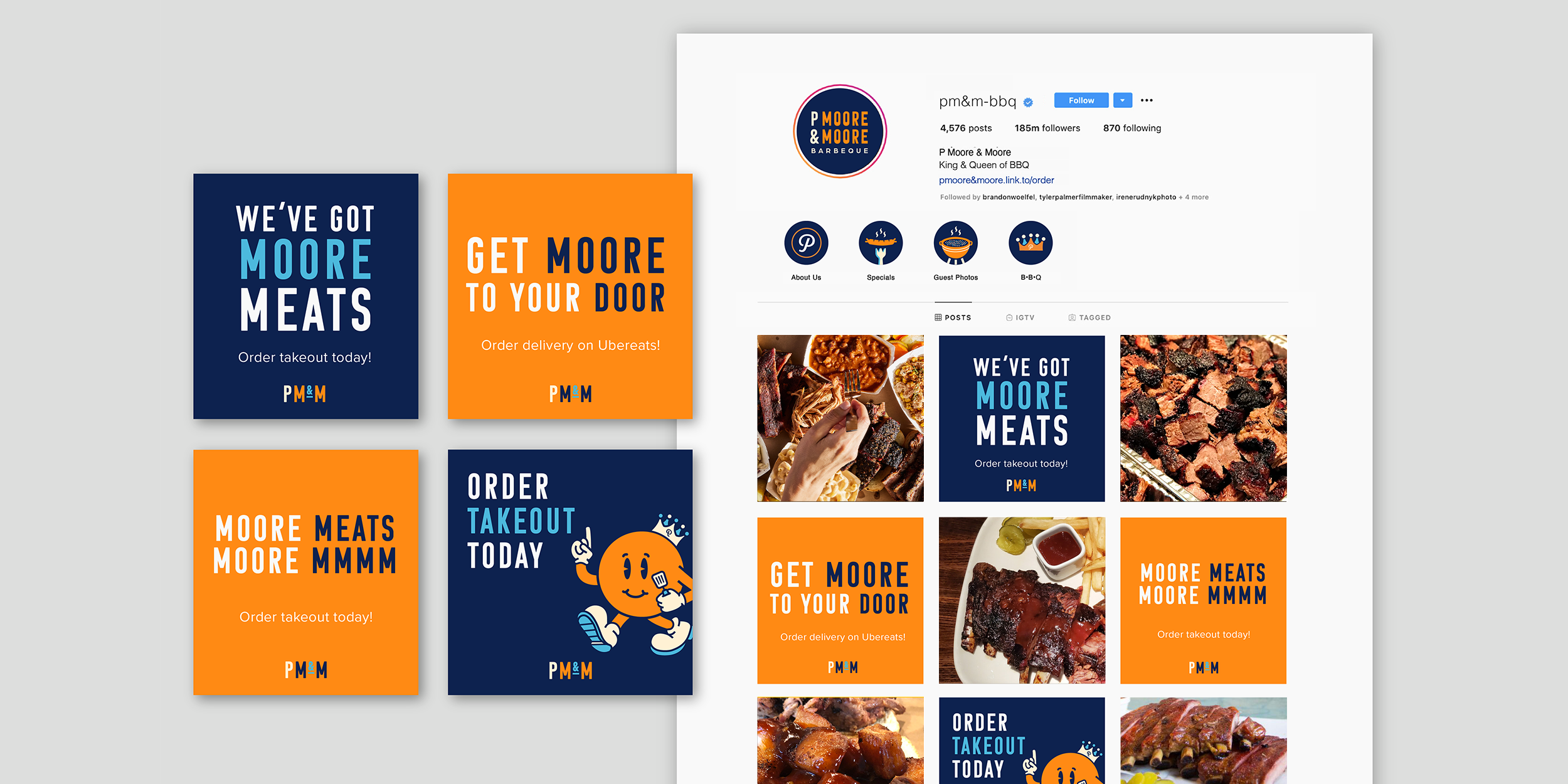
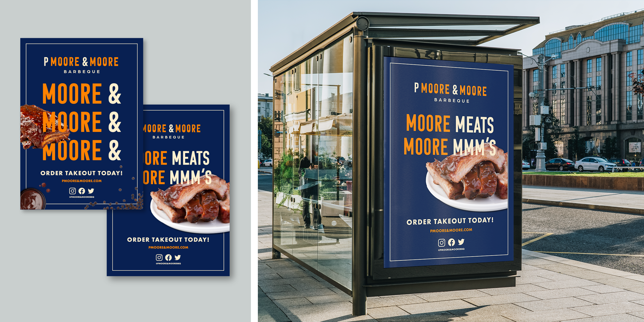

The result is a polished, intentional brand identity that establishes P Moore & Moore as a top-tier culinary contender. The new visual system provides a professional consistency that was previously missing, successfully differentiating the restaurant from its competitors. This passion project effectively demonstrates my ability to execute a full-scale rebranding, from conceptual strategy to final production-ready assets.
Matt Houtman
Oops! Something went wrong while submitting the form

